The Difference Between Color Grading for Photos and Color Grading for Video
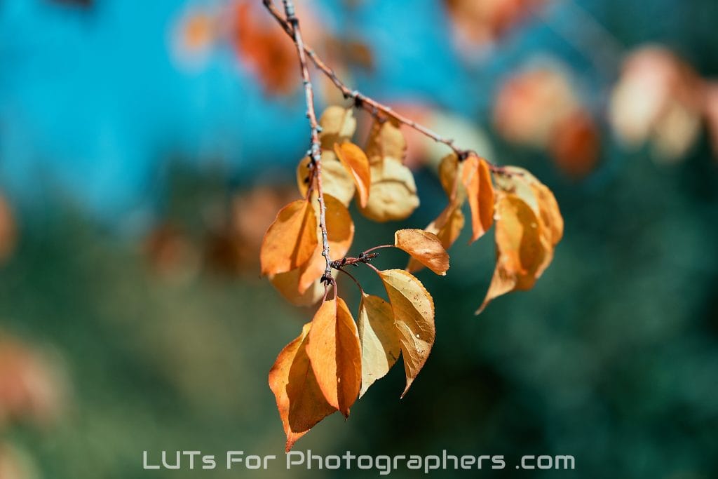
Get the right color, look for your photos.
Color grading is where creative vision meets technical precision — it’s how we shape the mood, style, and emotion of an image. Whether you’re editing a single portrait or an entire film, color grading determines how your audience feelswhen they look at your work.
But there’s an important distinction that often gets overlooked: color grading for photos is not the same as color grading for video.
They may use similar tools and terminology, but the workflows, goals, and even the color spaces behind them are very different.
Let’s explore what sets them apart — and why it matters, especially if you’re a photographer using LUTs (Look-Up Tables).
📸 Still Photography vs. 🎬 Motion Picture Workflows
The most fundamental difference between photo and video grading is how each medium captures and represents light.
Photographs are static high-resolution images, often captured in RAW format with 12- or 14-bit depth. This gives photographers tremendous flexibility to recover highlights, shadows, and color details.
Video footage, however, is made of many lower-resolution frames recorded in compressed log or Rec.709 color spaces — typically 8- or 10-bit — optimized for motion and real-time playback, not for extreme editing.
This means photo color grading focuses on precision and depth, while video grading focuses on consistency and continuity across hundreds or thousands of frames.
🎞️ The Color Space Divide
The single biggest technical difference comes from color space — the mathematical model that defines how colors are represented.
- Video color grading typically uses Rec.709, a color space standardized for HD broadcast and digital cinema. It’s designed for motion display, not high-bit editing, and has a relatively narrow gamut.
- Photography, on the other hand, works in wider color spaces such as sRGB, Adobe RGB, or ProPhoto RGB, each capable of capturing much more subtle hues, especially in greens, cyans, and magentas.
So when you apply a Rec.709 video LUT to a still image, you’re effectively forcing a limited color profile onto a much broader one — which can lead to dull highlights, shifted skin tones, or clipped colors.
That’s why professional photographers should always use LUTs created specifically for photography — designed to respect still-image color depth and tone.
🧩 The Editing Environment
In video color grading, the goal is visual continuity.
Colorists make subtle, scene-to-scene adjustments to maintain consistent exposure and tone as the camera, lighting, and location change. Grading is often done in DaVinci Resolve, Premiere Pro, or Final Cut using tools like vectorscopes and waveform monitors.
In photography, the goal is visual impact.
Photographers want each image to stand alone — with perfect skin tones, natural contrast, and rich dynamic range. Edits are usually done in Lightroom, Capture One, DxO PhotoLab, or Photomator, where fine color adjustments are made to a single frame at a time.
That’s why photo-based LUTs, such as LUTs for Photographers, are tested on RAW stills rather than compressed video frames — giving editors more flexibility to push color creatively without losing detail.
💡 Creative Intent: Subtle vs. Cinematic
Video color grading is often about storytelling flow — guiding viewers through a sequence. It’s about emotional tone over time.
Photography color grading is about moment perfection — capturing the feeling of a single instant.
Where video LUTs aim for cinematic contrast and uniform tones, photo LUTs are designed for accuracy and texture. A photographer might want to enhance skin tone warmth, deepen skies, or balance natural light, while a video colorist focuses on scene-to-scene cohesion and motion response.
🎨 Why You Should Use Photography-Specific LUTs
If you’re a photographer, using LUTs designed for Rec.709 video footage can cause unpredictable color shifts. They simply weren’t built for the high-resolution, high-bit, wide-gamut images captured by modern cameras.
LUTs for Photographers are built differently.
They’re engineered in Adobe RGB and sRGB environments, tested on RAW still images, and optimized for professional workflows in Lightroom, DxO PhotoLab, Photomator, and Capture One.
The result: consistent, natural color with smooth tonal transitions — exactly what photographers need to create stunning, print-ready work.
🖼️ In Summary
| Aspect | Photo Color Grading | Video Color Grading |
|---|---|---|
| Color Space | Adobe RGB / sRGB / ProPhoto RGB | Rec.709 / DCI-P3 / Log |
| Bit Depth | 12–14-bit RAW | 8–10-bit video |
| Goal | Single-frame perfection | Scene-to-scene consistency |
| Tools | Lightroom, DxO, Photomator | Resolve, Premiere, Final Cut |
| LUT Design | Wide-gamut, still-image optimized | Broadcast-gamut, motion optimized |
🌟 Final Thoughts
Both photography and video rely on color to tell stories — but they speak different dialects of the same language.
When you grade a still photo, you’re sculpting light and emotion with extreme precision. To get it right, you need tools made for your medium.
That’s why LUTs for Photographers exist: to give still photographers professional-grade color science built specifically for their craft.
Whether you’re editing weddings, portraits, landscapes, or fine art, using LUTs designed for photography ensures your colors remain accurate, expressive, and true to your vision.